LIMOŠKA
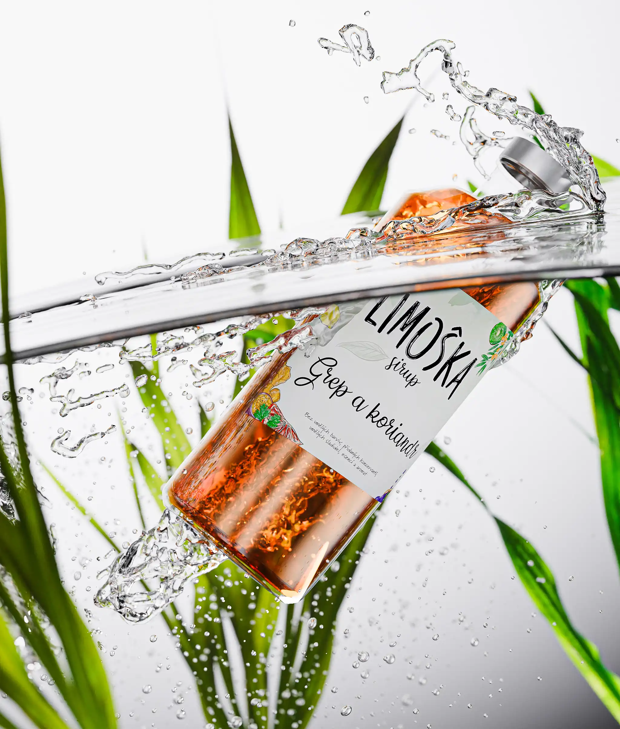
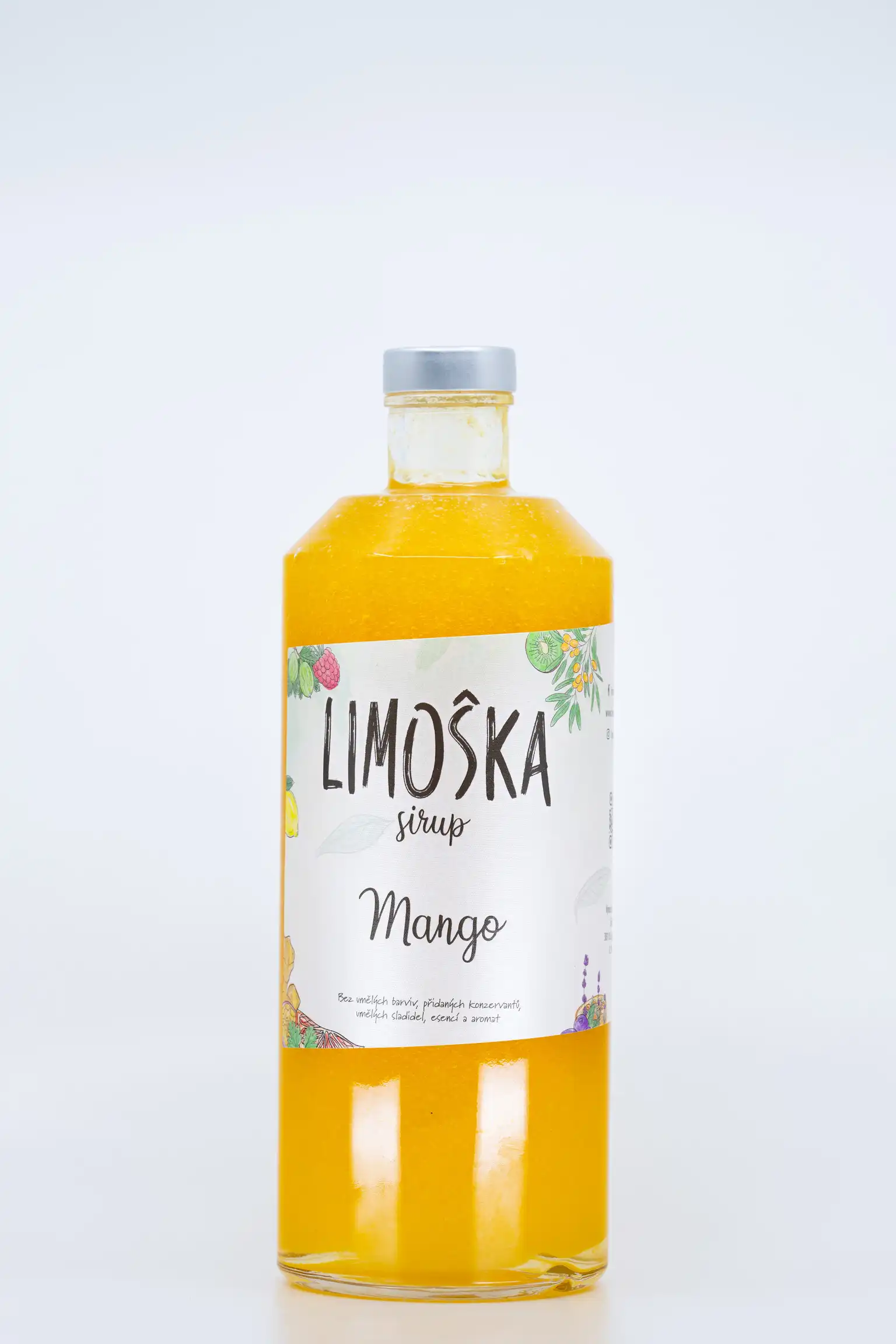
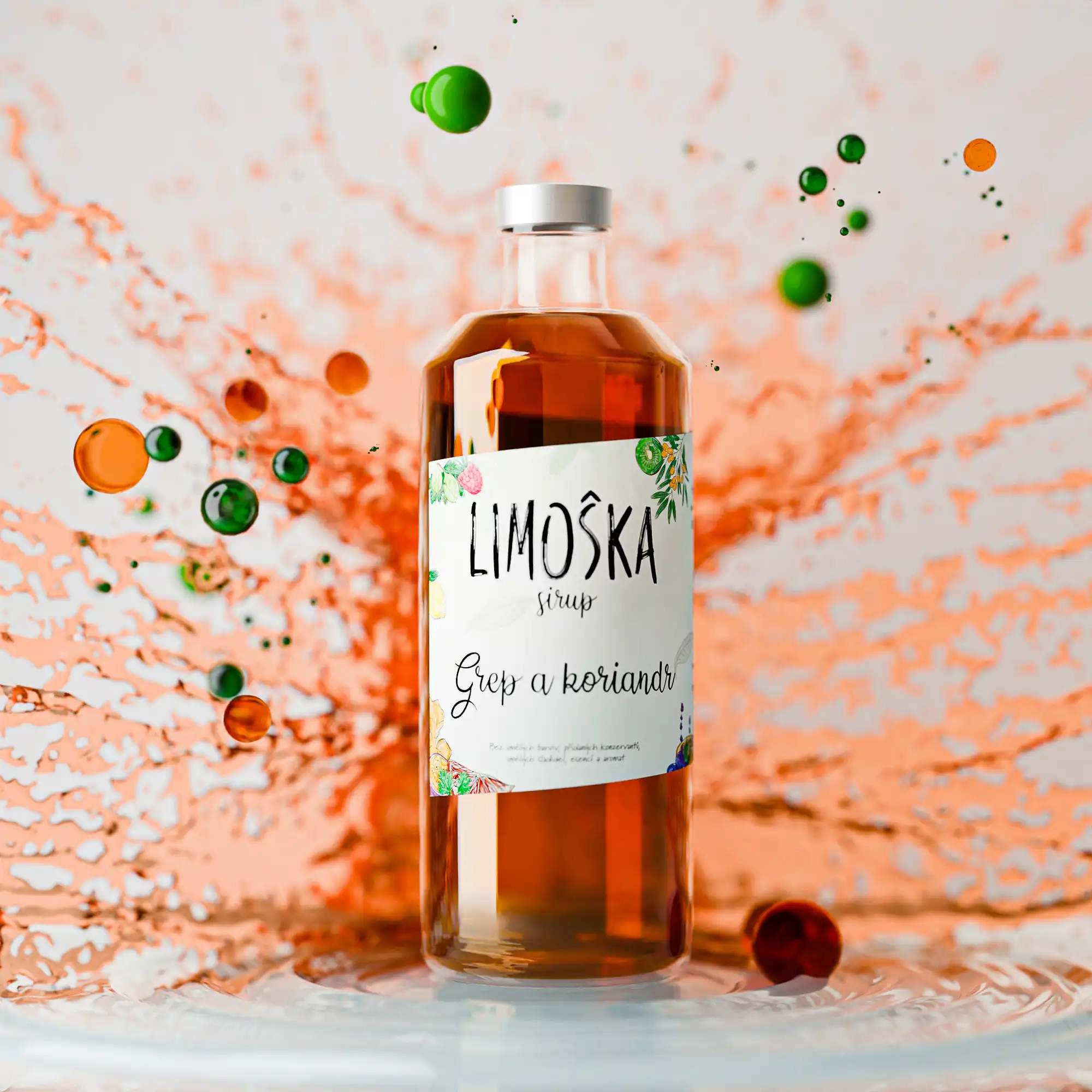
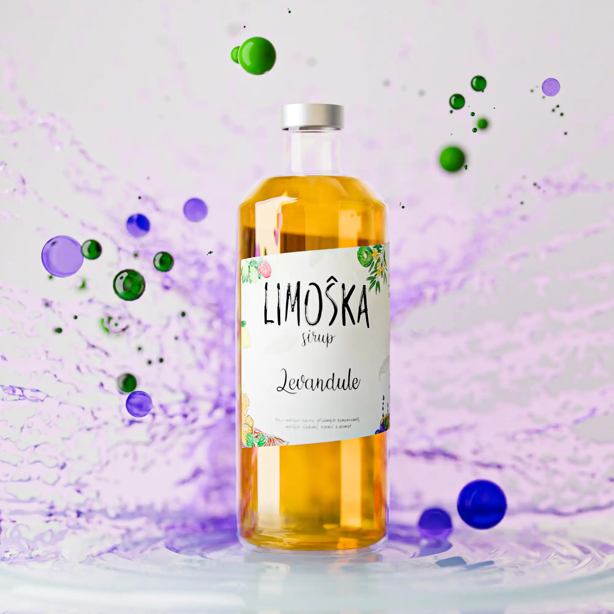
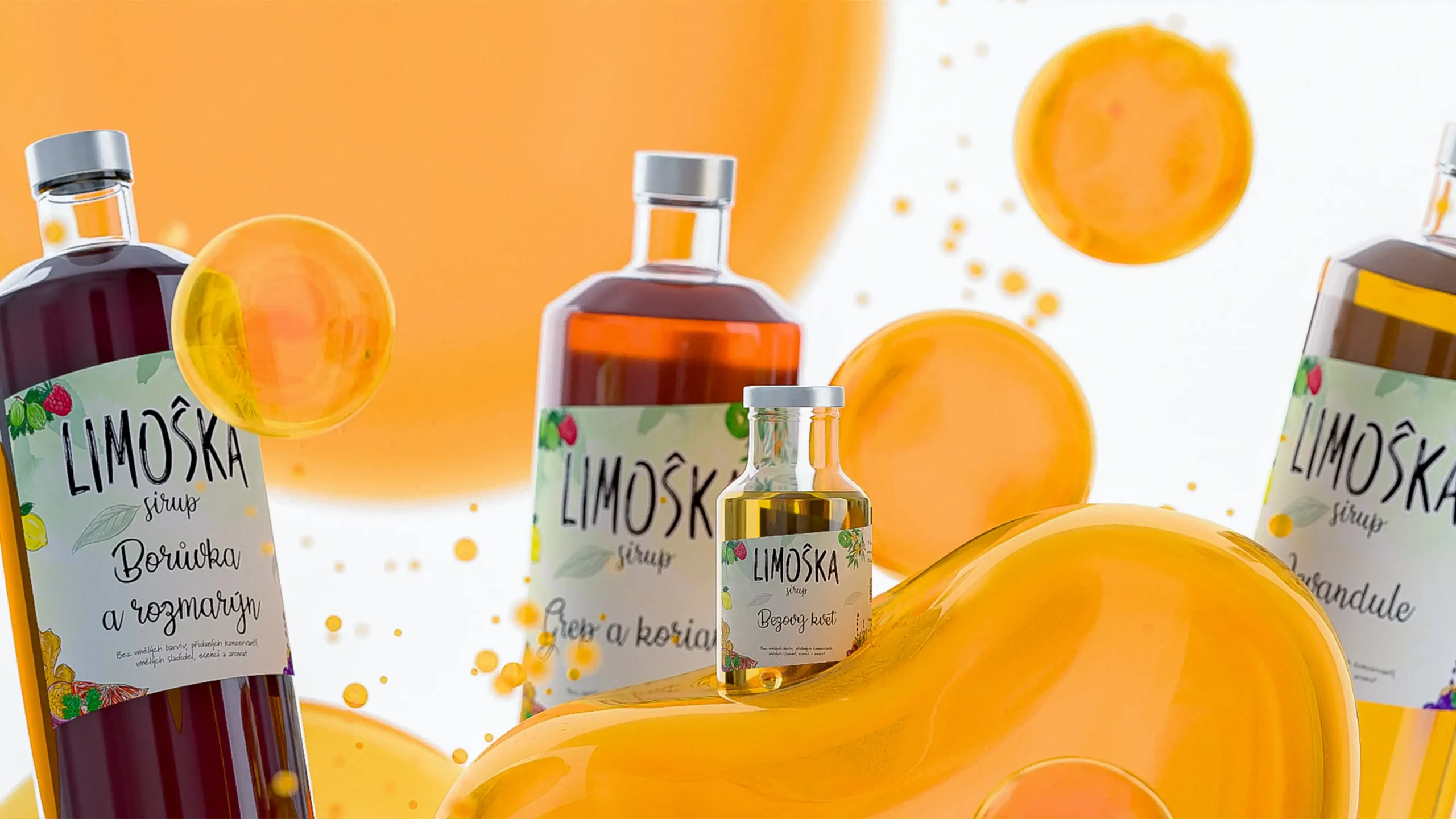
For Limoška, a company specializing in fresh fruit syrups, I revamped their logo and label design, replacing basic illustrations with custom fruit artwork. I continue to collaborate with them on event flyers, menus, and 3D bottle visualizations for cohesive brand communication.
Client:
Limoška
about the project
Limoška, a company known for producing syrups made from fresh fruits without chemicals, required a fresh take on their branding while maintaining their playful identity. I was tasked with redesigning their logo, which originally featured a brush font and simple fruit illustrations that felt too basic. Keeping the brush-style font, I eliminated the old illustrations and created new, detailed fruit artwork that reflects the various flavors they offer. These illustrations were then incorporated into a new label design, placed on skewed labels to contrast with the bulky, round glass bottles, adding a modern twist while keeping the brand fun and approachable.
In addition to the rebranding, I continue to work closely with Limoška on creating event flyers, custom menus for events, and 3D visualizations of their bottles for use in banners and advertisements. This ongoing collaboration ensures consistent brand communication and a cohesive visual identity across all platforms and marketing materials.


