Dopping
sweet point
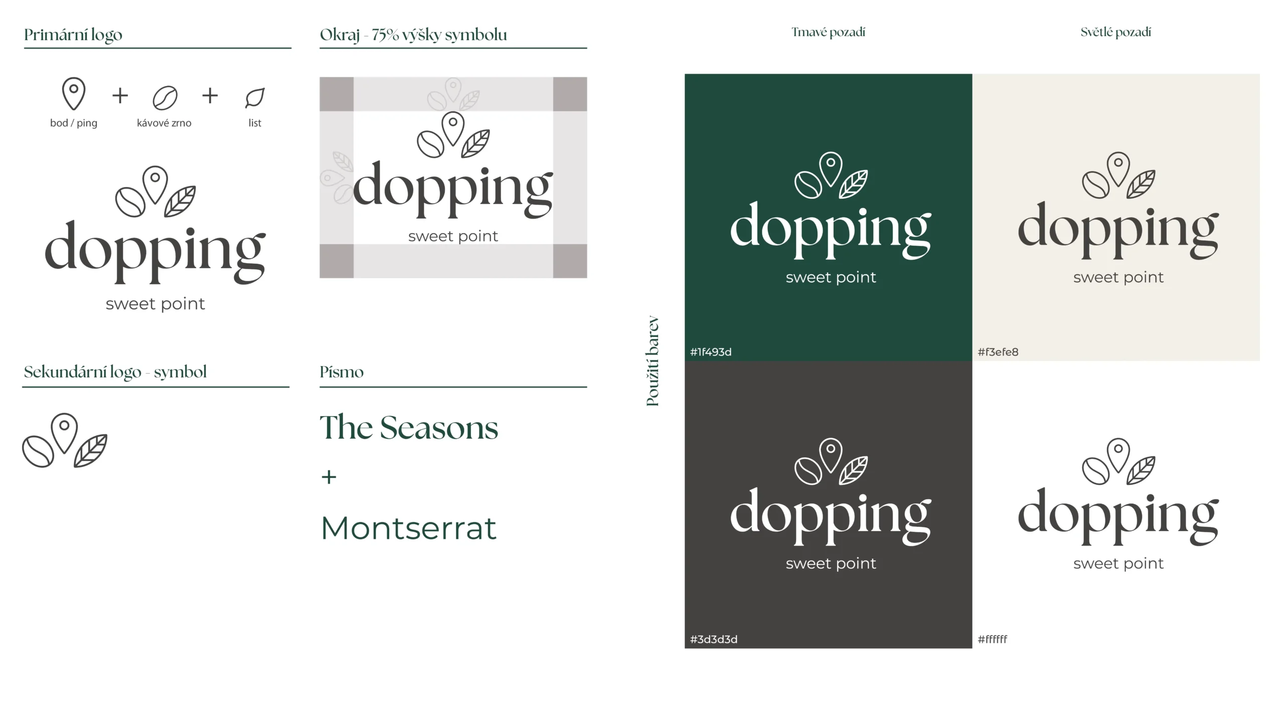
For Dopping,I designed a simple, modern logo and color palette that complements the café’s minimalist design along with a basic logo manual for consistent brand application.
Client:
Dopping Sweet Point

about the project
Dopping Sweet Point, a café offering homemade sweets, needed a brand identity that aligned with its clean and modern interior, featuring black, white, wood tones, and plants. My task was to design a simple yet stylish logo along with a cohesive color palette that would reflect this aesthetic. In addition to the logo, I developed a basic logo manual to ensure consistency in brand usage across different platforms and materials. The overall design is versatile, modern, and perfectly suited to the café’s inviting and minimalist atmosphere, establishing a strong, recognizable brand identity.


